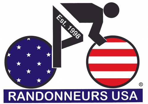
Current RUSA logo (as off March 2013)
This beauty has been in use by RUSA since the very beginning, I think. I have always thought it is as current as the cold war, pay phones and VCRs and pretty as the back of my stove. My intention with this comment is NOT to offend whoever came up with the logo above but just to express how I feel about it.

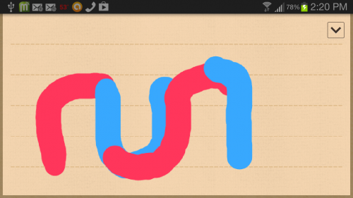
A rough idea for a RUSA logo
Too much time in my hands? One day while waiting for a riding partner to arrive I started playing with the memo app of my Galaxy S3. This is the raw idea I came up with. A concept for a RUSA logo

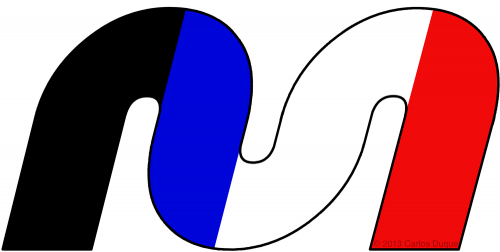
My version of a RUSA logo
On a slooow morning, I came up with this RUSA logo, (© 2013 Carlos Duque) What do you think? Yes, I can add the "randonneurs usa" text under it. I have never purchased anything with the RUSA logo on it as I think it is the ugliest thing. This one can be easily be reproduced as a reflective patch and also lends itself to be used in the same way as the current (uggly) one. Want to attract new riders, young riders, more women? Perhaps an update to the image is in order? PLEASE RUSA powers that be, would you consider changing that ugly thing with anything else? Does not need to be mine above but anything else that looks better than what you use now. Oh yes many would feel my version is worse than the current one and I am perfectly fine with that, create your own new version and let's move this idea of changing RUSA's anticuated image.
BTW if you, RUSA, want to use my logo design all you have to do is ask and I'll give you all use rights.
(First posted March- 4-2013 at 11:07 pm)
No related pages or links.